Jun 26, 2008

the New York Times reviews a new film...


From A. O. Scott:

"The first 40 minutes or so of “Wall-E” — in which barely any dialogue is spoken, and almost no human figures appear on screen — is a cinematic poem of such wit and beauty that its darker implications may take a while to sink in."


Wow. And that's only the first sentence.
I haven't seen it yet. Those of you that have, I'd love to hear your impressions.

Jun 22, 2008

Good Morning! Disney Commissary Breakfast Menu circa 1940


Following up on my earlier post with the lunch menu from the Disney Burbank commissary (or "Studio Restaurant" as it's called here), I discovered the place was swanky enough to have not one but at least two specially-made menus for mealtimes. Here's what you would have seen if you'd arrived like Donald at about 8:34 am in about(my guess)1940:

(click the interior of the menu to read it):


Makes one hungry, doesn't it?

(for the record, it measures approximately 9x5.5" when closed)

Jun 21, 2008

New York Times writes about the Comic Con's relations with Hollywood


Normally I'd eschew a post of this kind--there's not much that's news in it--but this year the animation-to-comics quotient is going to really spike, and moreover while I'm a longtime daily reader of the New York Times and enjoy it, although occasionally their take on the doings of our west coast seem, well...a little clueless. Late to the party as it were.

Case in point: today there's an article that deals with Hollywood studios' presence at the annual San Diego Comic con. While the piece is titled "Comics Convention Beckons Hollywood"(click the title to read it in full), the print version adds a sub-header: "The film business grudgingly courts fans in San Diego". The internet version looks even more askance, using this: "Hollywood still leery of Comic Convention".

Really now?

It's exactly what you'd expect. No cliche about unwashed bodies goes unused. One of the accompanying photos online (there's none in the print version) shows an overweight, bespectacled teenager sitting cross-legged on the floor engrossed in his reading material,paper receipt dangling from his mouth. Reference is made to something called "Con crud" which it's suggested is either a common cold or an STD. Ugh(I suspect that the Con magazine that offers numbered "tips" and cites the aforementioned "crud" is probably meant to be a little more humorous in tone than the Times presents).

The overall slant is that a motley, frighteningly crowded contingent of cosplay folks and "fanboys" are "grudgingly" catered to by an unwilling Hollywood. It bemusedly describes things that go wrong (example: Joel Silver was actually kept waiting last year while star Kate Beckinsale claimed to be held up at a railroad crossing-no doubt the gospel truth as anyone knows who's been to the Con and tried to cross the street when the crossing arm goes down; the thing seems to take a minimum of 35 minutes each time). You'd think from the overall tone-studio people are desperate to get in and get out as quickly as possible-that the City of San Diego, is, well, perhaps a little plebian.
Actually the downtown area that surrounds the convention center is a Seattle-like, revitalized district featuring a lot of great restaurants and pubs and an enjoyable sidewalk scene not often seen in Los Angeles save for a few blocks of 3rd street, Robertson, Melrose or the Grove-familiar haunts of Business players(and I daresay Times scribes).

But back to the picture painted of ComicCon: while we get the travails of this or that company and their booking acrobatics, no mention is made of the extent that arguably the most powerful(certainly the most world-famous)director in Hollywood, Steven Spielberg, went to last year to do a live feed to the convention from the set of the then-filming "Indiana Jones and the Kingdom of the Crystal Skull". The SRO crowd was treated to a meet & greet with not only all the principals- Harrison Ford, Shia LeBeouf, Ray Winstone-but the confirmation by Spielberg officially for the first time the casting of Karen Allen. No, in lieu of any of that proof of ComicCon's importance we get a focus on a production company called Summit Entertainment-an outfit with a slate of titles I've never heard of. They're probably niche fan properties.

Neither was there any mention that "Iron Man" was represented last year by stars Robert Downey Jr. and Gywneth Paltrow and director Jon Favreau, all of whom have been to the snarkily compared Cannes film festival many times also, I'm sure.

No mention of "Hulk" star and writer Edward Norton, prince of the Serious Acting school of critics(with whom I agree-he's good) who also deigned to go to San Diego for his Con appearance and panel in '07.

No Pixar, either, although as far as I am aware Pixar for years has maintained a strong presence there, planning panels featuring its most well-known artists and directors, plus peeks and premieres of upcoming work.

I wonder how much more significant contributing film honchos could get than Spielberg, Lasseter, Bird, Lucas...yet none of them are mentioned. Nor is there a mention of Matt Groening, Bill Plympton, JJ Abrams, and a host of others I can't think of off the top of my head. Not chopped liver they. Remember, this is all just last year I'm citing, not a 10-year span of attendees. One year.

The fact is, for a lot of people who aren't your sterotypical comics geek the Con has become cool; it's a place to gawp, buy, and party-and not at Ralph's either(another mention in the article presumably showing how low-rent the affair skews).

I'd bet writer Cieply has never attended San Diego himself. He seems to have approached this article armed with a dated, preconceived notion of what a crowd attending something called a "Comic Con" would be like-and he was only partly accurate.

How much more intriguing if he'd been aware-and related to the readers-how a humble, standard annual comics show became over 20 years a mega-marketed, serious venue that makes clear the reality of pop culture's cross-pollination in its most egalitarian and visible form?

Instead it's merely a brief story about the supposed discomfort that Hollywood must endure to market to the sorts of people who buy tickets to "blockbusters". Sure, there are plenty of sweaty bodies-I'm sure I've been one since the heat is fierce in San Diego every year and the Convention Center main exhibition room always seems overloaded with attendees. Yes, there are people in costumes, which I always thought were great fun to look at. Yes, the Con is a ridiculous, hot, impossible to navigate, frustrating carnival of giant Lego Chewbaccas, crazy walkaround things, killer backpacks on oblivious collectors, nerdy crazy people, cool crazy people, artists, scenesters, lots of camera crews and a terrible din of a million people all talking at once. It's terrific fun.

But what's also there is is an every-growing contingent of film professionals-mostly from animation-who are presenting their own work alongside the huge players, offering self published books and toys as well as other merchandise they've designed, some of which are substantial businesses; former and current Disney, Dreamworks and Warner Bros animators' companies such as Conduct Happiness, Electric Tiki, Red Window, Red Tango all selling, networking, and in general having fun amid all the chaos; it's been one of the places that, love it and/or hate it, is a place to see and be seen and meet up with old colleagues.

some of last year's haul, and a big part of why I and my friends go to the Con

Given the people I know of this year presenting their own books, prints and wares there's a good article to be written about the crossover between the graphic books of the past and present and the people whose graphic work is usually employed in big-budget "Hollywood" animation doing their own small-press thing.

And you know, all of us are geeks if by geeks you mean lovers of cool stuff yearning to see new and exciting work of all kinds-be they filmed, drawn, sculpted or written. In that sense we have a lot in common with the non-pros sitting cross-legged on the floor. By the way, I confess I've done that myself as have most of my (adult) friends. That's because there are no other places available to sit in the Convention Center.

Michael Cieply-why don't you come on down? The train is a great ride.

See you in San Diego.

"Comics Convention Beckons Hollywood", by Michael Cieply 6/21/08

Jun 19, 2008

Eric Goldberg's New Book


"Character Animation Crash Course!", a brand new book by legendary animator, Freddie Moore expert, collector of exquisite stuff, sage and all-around nice guy Eric Goldberg is on its way to the bookstores in a few weeks.

Here's the official description from the publisher, Silman-James Press:

Character Animation Crash Course! is a veritable Genie's lamp stuffed with everything the aspiring animator could wish for! Renowned animator Eric Goldberg's detailed text and drawings illuminate how to conceive characters "from the inside out" to create strong personalities. Classic animation techniques are analyzed and brought to life through this unique book and its accompanying CD that offers readers animated movie examples that show, in real time or frame-by-frame, the author's principles at work. Add to this Goldberg's discussions of classic cartoons and his witty, informative observations based on the wealth of knowledge he's gained during his 30-plus years in professional animation, and you have a tour-de-force guide to character animation with the classic touch.

As described above it comes with not only a distillation of Eric's prodigious knowledge of the craft of personality animation but a DVD as well loaded with quicktime tests he's done himself, illustrating the principles he describes in the book--all the essentials.
Through the usual .05 degrees of separation that seem to exist between everyone in Los Angeles, I learned of this book's imminent birth while visiting the publisher at her home. Gwen Feldman is not only "Silman-James Press" but is an artist herself--she's a member of Chouinard's last graduating class in '71, former pupil of the great ones such as the late design teacher Bill Moore (about whom-like all his students-she's got some great stories). One of the most intelligent and creative people I've ever met, my husband's good friend even before I met her, she's an amazing photographer, art collector--someone whose range of interests still surprises me after twenty-some years.

Case in point: I blew a gasket when she casually mentioned a few months ago that she was publishing a book by Eric Goldberg. I got a glimpse of it completed then, and I was thrilled to see what was going to be in it. I'm sure you won't need me to tell you it's going to be a must have.
Eric's going to be debuting and signing it at Comic Con, on the Friday and no doubt at several other venues in Los Angeles as well. I'll add more details as I get them. For now it can be pre-ordered at Amazon and through the Creative Talent Network's portal.

Can't wait. And some guy named Brad Bird wrote the forward, too.

Jun 18, 2008

David Derrick blogs about drawing from life and plein air sculpting


Story artist Dave Derrick is a guy who inspires me with his talent, energy and determination to constantly seek out and accomplish new things. He's just put up a blog which can be visited here.


I have an especially soft spot for the sort of animal drawing he's adept at. He draws constantly from life, but to my eye his animals always have an extra personality and charm that's probably equal parts what's there--and what's inside the artist himself.

In his brand-new blog he's going to post examples of his studies and the ways he uses them-most recently in sculpting. He's definitely someone to watch and learn from (he's one of the artists included in "Scrambled Ink" as well-that work is pictured in my earlier post). Pay him a call.


all artwork courtesy of David Derrick, from his blog

Jun 13, 2008

"There is no charge for Awesomeness"


'Kung Fu Panda' Exclusive Video: Opening Dream Sequence


James Baxter, Chris Sonnenberg, Jen Yuh, Simon Wells, Jed Diffenderfer and a lot of other guys--your ears must be burning because a lot of people are talking about this work. Kudos to you!

Jun 11, 2008

Joe Grant-tile designer

Diaries reader and LA Times historian/writer/blogger Larry Harnisch directed me to an Ebay auction for the item pictured here, which has got to be extremely rare. I was surprised when I won it without much competition, as the signature affirms it's designed by the great Joe Grant, onetime head of Disney Animation's "model department"(what's known now as visual development) and until his death at age 96 a few years ago once again employed as story man and resident genius at Disney's. His influence over nearly seventy years of animation history has been profound.


When Grant left Disney in the late 40s he started his own business which included designing decorative tiles such as this. I'd never seen one before, and think it's a wonderful thing measuring six inches square. Apparently it's the right-hand part of a pair titled "The Gossips", to be installed one guesses on a splashboard in a kitchen, dining/pantry area or some other nook where a tile accent would go. Neat drawing, nice color, lovely loose lines. I'll bet there are collectors out there with more than a few examples of these--at least I hope so.

Just a little something to share. I apologize for the inferior photography provided via iPhone; I tried for a clear closeup of the signature as well and failed. But at least one gets an idea.

Jun 9, 2008

"Scrambled Ink" starts to spill


The other day an advance copy of Scrambled Ink-the book that I and six of my friends had collaborated on-arrived in my mailbox. It's a weird feeling, to be able to finally hold an actual book. In hardcover, 180 pages and with a gracious foreword by Mike Richardson(owner/publisher of Dark Horse), it's slated to be on shelves in bookstores everywhere in July as well as, of course, online.
Dark Horse did a beautiful job-they're really a class outfit. Diana Schutz(our editor), Dave Marshall and Tina Alessi all went above and beyond with its production.

I'm very proud of my friends who managed to produce beautiful extracurricular work while busy variously animating, doing story and visdev. We're all very different from one another and our stories reflect it, but when I flip through the book I see the personalities of these guys I've come to know and love on the page, and the stories seem to me to go together in much the same congenial way we did sitting under the olive trees at work eating lunch, chatting cross-legged on the floor of one another's offices, crammed into an Amtrak booth bound for San Diego or leaning furiously over the foosball tables. Good times.
I hope it finds readers who enjoy reading it anywhere near as much as we did doing it.


There's plenty more where this came from, but here's a sampling of what's inside the covers:

a page from "Burger Run" by Dave Pimentel

Ken Morrissey's illustration from "Greedy Grizzly"; he wrote and illustrated it, with an assist on the prose from Keith Baxter

a glimpse of J.J. Villard's work

Dave Derrick's is a story set in Africa

Ennio Torresan's roman a clef, highly autobiographical

...and me(plus my inspiration on my mousepad there):


The table of contents; click to enlarge
When the book's more readily available we're probably going to do a couple of shindigs with it(the fun part of publishing!), which I'll post about here as they're scheduled.
Certainly most of us will be lurking in San Diego the week of the Con. Hope to see you there!

Kristy Gordon


illustration courtesy of Kristy Gordon

I first saw her work a couple of years ago via some discussion on other pages, and I loved it. So many contemporary artists have eschewed the figure(or moreoever, any evidence of serious drawing ability)in their work, but not she. She does landscapes, still lifes and portraiture. She's worked in animation (I believe at Spumco) but now she's carving her own way as a fine artist-how I hate making that distinction but for the sake of description it at least communicates the milieu she's chosen.  We used to comment back and forth a lot but I've been remiss in keeping up, and after getting some nice feedback from her the other day realized I didn't have a link to her blog.  So now it's added, and also here.
She's definitely worth reading--I love it when people post about their process.


"Portrait of a Puppet", oil on canvas © 2008 Kristy Gordon

Jun 1, 2008

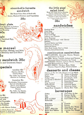
"Your Order?" From the Disney Commissary c. 1940


Hans Perk of A. Film L.A. has been sharing his photographs of the (packed) interior of the Walt Disney Commissary taken in the 40s, and thanks to a link he posted I was able to acquire this swell item.
I'd date it to pre-WWII, just after the Burbank studio opened-1940 perhaps(the only characters shown being the shorts stars, Snow White and Pinocchio).

I love looking at menus from the first half of the 20th century; they're usually wonderfully decorated and the wide array of offerings is so superior to the fare an average "american cuisine" place has today. Of course there aren't too many of these sorts of eateries around at all anymore, not even in a city as large as Los Angeles. The closest thing might be a Hamburger Hamlet or a Jerry's Deli(neither of which live up to their reputations in my opinion). Then again Musso & Frank(mentioned below) would seem to have the same menu now as 60 years ago...I mean really, exactly the same, which is one of the reasons I enjoy going there.

So here, complete with discoloration I didn't fix in Photoshop is the interior of the menu. It's large, printed on a medium-weight card stock, nothing flimsy. Lots of fun menu selections and appealing artwork. There's beer, too. And a prime rib sandwich for all of 35 cents. See-it really was possible to live on fifty dollars a week. Or in the case of the top animators, several hundreds a week. Every few dollars made a difference. There's a reason for nostalgia!
Click the images to open them in a much larger size.


Mary Blair cards


Here's an example of an Ebay auction that got away many weeks ago-a lot of commercially sold Mary Blair card designs.
These are clearly some of Mary's visual development generated from the "goodwill tour" Walt Disney and some handpicked artists took to prepare for their films "Three Caballeros" and "Saludos Amigos"; they bear the Disney "signature" at the lower right.
As I didn't win these all I have are these rather poor photos to show, but I think they're well worth posting as they're just so hard to find. They went for over $120.

Panda Proves Po(tent)


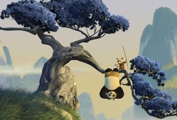
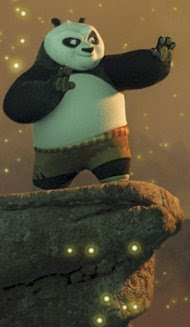
I don't often do this (in the interests of recusing myself from places I've been associated with), but I want to congratulate the crew of "Kung Fu Panda" on a simply top-notch achievement. It has beauty, personality, and most of all sincerity. It's a real highpoint from Dreamworks, and I'm one of those who believes (actually, there are quite a lot of us) that anyone raising the the animation tide lifts all boats. 
I didn't work on it but I know those who did really pushed themselves-plainly to great effect. I only wish I had some artwork handy to post here, because so far nothing I've seen online does the visuals justice(anyone have any of Nico's drawings lying around?); These images taken from a review site will have to do.

I look forward to seeing it again and taking along friends and family. Good show, people.