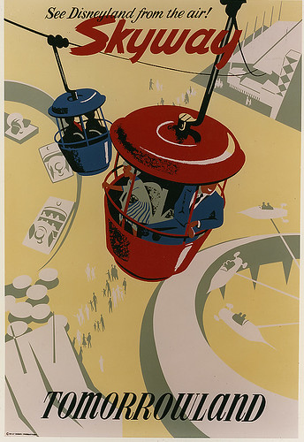

The Skyway--what a design!
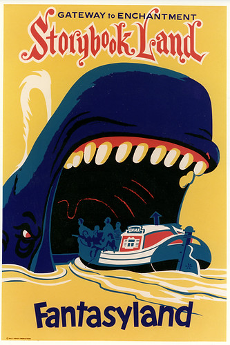
And Monstro's certainly not bad either...I love the spout, and the great use of shadow. Mysterious! Terrifying! I'll admit this gentle little ride scared the pants off me as a kid--a small kid--and of course it was one of my mom's "favorites". Oh, dear. It took me years to figure out that it was because she could sit down, but still be "taking me on something". And the miniatures are charming...boring to a teenager, but for a five year old--lemme at 'em!
Favorite Storybook Land guide quote(from a high school-era visit I and some friends made): "Here we are passing Alice's village...there's the church...notice the tiny tombstones!" I kid you not.
disney, disneyland, fantasyland, illustration, tomorrowland, amusement parks, posters


2 comments:
Your site is incredible and I love these old posters - the color palettes are just fantastic. I was inspired by the Monstro image and made a desktop using Illustrator's LiveTrace feature. Check it out at my site: www.jeremymace.com - By the way your sketches and art are wonderful. How many adjectives can I use in one comment?
Those are genius. And the colors are amazing. Thanks for sharing.
Post a Comment