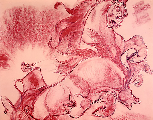
I came across this as a color transparency in a film memorabilia shop, and had it printed up. I have no idea whose work it is, and I hope someone has a guess. From "Fantasia", the Pastoral sequence--it might be a storyboard panel, but is more likely visual development. Beautifully dynamic.


21 comments:
Hello Jenny,
This exact picture is shown in John Culhanes Fantasia book published by Abradale press New York.
The text with the picture doesn't give a drawers name.
Just the Character Model department.
Appollo god of light from The pastoral Symphonie.
The picture in the book is in black and white and the horses are running in the opposite direction.
You just post some of the most inspirational art. Yours has become one of my favorite sites to visit. Thank you for this posting; a forceful work.
Wow, Jenny. You seem to have a treasure trove of inspiration. This is so powerful. Glad you can share these.
My God, that's cool. If only the whole piece had had that kind of force and vitality.
Paul--how true; I actually really enjoy the Pastoral sequence, but there are bits that make it much harder than it should be...it's got some of the absolute greatest animation, and some of the "worst"--in the sense that for once, all the slings & arrows critics of the time leveled at Disney were somewhat justified by the "cutesey/corny" factor in some scenes. On the other hand, there are shots--of the flying horses, for instance--that are just magnificent(one particular passage, the whole family flying through the clouds--little black horse trudging through last after a pause--earns its cuteness without toppling over into tweeness--again, just my opinion). The toe-curling anacronistic treatment of the "centaurettes" also changes for the better, briefly: later when Bacchus is holding sway and the girls are galloping in and out of the frame, no longer teenagers but suddenly a bit more sirenish, it shows what could have been.
very informative blog, you've done some great drawings here as well....would like to see some sketches of your horses
keep up the gd work
I still prefer the "Rite of Spring" sequence--although I REALLY love the deco scenic design in the "Pastoral" sequence. I guess I just have a thing for dinosaurs...
Wasn't there some kind of a stink because they took the nipples off the centaurettes??
You summed up my exact feelings, Jenny. The Pastoral is such a missed opportunity in so many ways. Could there have been riper subject matter for the Disney animators at that time than Greek mythology? And so many of the shots are glimpses of what could have been. --Ah, well.
Love the site. You're one of the more articulate bloggers out there right now. Keep it coming.
Hi Jenny. New to this blog but you can bet I'm going to stick around. As Paul said above, your writing is wonderfully clear and intelligent. As for the "Pastoral" -- well, the "datedness" has always been part of the charm for me. Thanks, in fact, to FANTASIA, the very digits of the year 1940 evoke for me the spell of a lost America that was somehow traditional and futuristic all at once (sort of like Walt himself). And anyhow, the "Pastoral" is heaven for Fred Moore fans; his patented "Freddy girls" hardly ever made it to the screen this intact. The Olympian locale was simply the ideal habitat for his innocent, mischievous nudes.
Great piece! What a dynamism! Those volumes in movement remind me a bit the futurism of Boccioni's things in motion.
Lovely ferocity in this drawing.
Thinking about cuteness... we westerners seem so self concious of a form that is admired by many in the orient-no?
Doodlers, you nailed it--I'd say we have a love/hate relationship with "cute"--especially in the art community.
Not to say the Japanese/eastern take can't get a little...well, bizarre; that has its less-than-wholesome side as well. Heck, it's all complicated.
Funny, there's definitely a modern day western problem about accepting honest sentiment, or cuteness--everything's just got to have an edge or it's phony. of course that isn't so, and it's become so overdone, the whole snark thing.
I digress again! But it's an interesting subject.
Paul, Rod, Luca--many thanks for the comments and observations!
Wow I really love all the inside things you have on your blog I am now a fulltime visitor!! Disney pitching his Idea to a room full, Man!! that takes guts. Kudos!!
Steve
You must have an expansive inspirational gallery at home. Thanks for sharing.
Jenny, Thanks for the feedback! As you say, it's a tough thing in our culture to accept sentiment at face value. On the other hand, cuteness can be cloying, scary and disingenous. Nice 'talkin' with ya!
Now that we've read this comment thread with such detailed observations from you and your contributors on Fantasia, we'll need to watch it again. It's been a while.
Arna
Hi Jenny,
The drawing is by Martin Provenson...
Character Model artist and Childrens Illustator extraordinaire!
J.
MARTIN PROVENSON.
J.
Yowza....Cg can't come close to the power of that drawing! once again..yowza!
The key to cute is it has to be honest. I mean if it comes out of the pencil cute then let it be cute. Thumper, for instance, is a work of genius. Anybody who tried to change Thumper would be a vandal. But you can't get honest cute on a mandate. You can't get cute because some focus group says cute moves units at Wal-Mart. I think some artists have an innate genius for cute. God MADE THEM to do cute. Others He made for the satiric or the grotesque. But it takes both kinds to make a world! ;-)
Oh, that's well said Rod.
Post a Comment