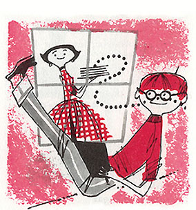

Ward Jenkins has singlehandedly amassed one of the best collections of fun 50s-60s illustration I've seen anywhere, and he blogs about it regularly and well. His most recent post is chock full of charming graphics by an illustrator named Lou Peters, Go see it!


3 comments:
Okay I'm gonna get blasted here,but I for one, am soo past the over hyped,(and grossly over imitated) '50's style that the originals don't even seem that special anymore. Duh-- they're cute and/or well drawn.. so are lots of things from other eras.Many animation sheep.. er..people(who no doubt worship at the altar of anything mid-century',like formica boomerang tables and sunburst clocks--which were cheap crap then and are expensive crap now--and don't get me started on the architecture.. ugh..) seem to maintain this obsession with that particular era because it's supposedly 'cool' and 'unique'.. but it's become overly precious, and for too long now.Move on.
I know what you're saying, and hey--I can well understand your overload with a look that's become so pervasive that it's seemingly everywhere now. But I can't agree that because anyone's "sick" of it that invalidates any attractions or worth of the originals.
I grew up with the remnants of of lot of pop/googie, 50s and 60s design--and I really disliked it for years as "old stuff". Probably because much of the furniture in our house was cheap crap--or at least Sears versions of swedish modern, etc. twice removed...but that doesn't make the originals bad or wrong, and there is a constant in good design that isn't diminished because of cheap knockoffs. We had a "sunburst" clock in our home that had been there for about 10 years by the time I came around. I liked it as a kid because it looked like a sun to me.
Right now I have a 40s kitchen clock in red bakelite. When I see a better-designed one I'll buy it(if it's less than 500 bucks as most of those items seem to be that look halfway decent), and put the old one away, but so far I haven't seen one I love that's as well-designed and appealing, so the "kitsch" stays on the wall. And it looks great.
I don't care about "the era"; I like this stuff because it's appealing to me. Firstly I admire the technique, which--kitschy and familiar as it is now--still stands up to the now-pervasive use of all kinds of photoshop gimmicks: a man or woman using sponges, brush and pen to make a graphic statement that's simple, clear and direct. These 50s artists weren't going for masterpieces and I won't say such as these posted here are masterpieces, but the best of them clearly have a solid understanding of design and fun that I like.
Frankly, a whole lot of artists could do a lot worse than to learn from and absorb the techniques and abilities of thee people who were--of their era, yes--but also very adept craftsmen. This is what I hink is happening. I don't expect this stuff will stay ascendant forever, but I suspect everyone will absorb it and move on and change, as always happens. Sometimes it's great to look to the past(since NOTHING, but nothing in art is ever really "old" or "new")to learn and inform one for the future.
I guess I'm saying I can't see a problem with admiring these things for what they are. As for how glutted the world supposedly is with them, I can't let that taint my own enjoyment.
And for the record, ALL of the artists I know who like this stuff like a heck of a lot of other styles as well...I don't know anyone who only looks at these things to the exclusion of any other illustration or painting.
Jenny pretty much said it all for me, but I just have to say this: I love to look at that stuff. That's why I collect it. Point blank. I'm not trying to force anyone else into liking it -- I don't in my post, if you found the time to read it -- and I never will. I collect the things that I enjoy to look at and I will share it with others who read my blog, who like to look at that stuff as well.
It should be noted that I'm not stating any cause here. No, "Gosh! They don't draw like they used to! Wish we all could draw like this!" Nothing of the sort. If anything, it's a matter of me studying up on the elegance of line and design and character aesthetics that these illustrations possess -- how did they make it work? How can I embue the same charm and elegance into my own work?
What Jenny says about the artists she knows who like the mid-century design and illustrations is correct -- we like all sorts of things, not just mid-century 50's and 60's decor and design. I love that clean simple look, but I also love Rauschenberg, Basquiat, graffiti, and anime. Go figure. Anything that looks good to me, I'll study up on it and learn as much about it as I can. All to make me the better artist and animator that I strive to be.
Also, I don't want an artist to fall by the wayside here. Leif Peng does an incredible job of paying homage to artists past and that's all I'm doing here -- paying respect where it's due. Just trying to keep the spirit of a lost artist (Lou Peters) alive. If you don't understand that... well, then, I'm sorry.
Post a Comment