For the fresh, aspiring animation artist story is a mystery, loaded with questions. How should the panels look? How finished off and detailed must they be? And--here's one I've been asked many times, and wondered myself as a kid--how long is it supposed to take to draw each panel? It's as if there's a set average all professionals meet. Who knew?
The answers to those questions can be surprising. You start out, stumbling, learning as you go, picking up what you need, hoping you're doing it "right"--and even after some time in the business, you can still have an epiphany about the craft. I had one a long time ago, about what I'll call pretty drawings.
I was walking down the hall at work, and passed by a recently pitched story sequence. The drawings were pinned to the board, leaning against the wall waiting to be sent to the editorial department. I stopped and looked it over. The ideas were funny, but I was surprised by how raw some of the drawings looked. They weren't what anyone would call "pretty"; they had no background to speak of, seemed a mass of lines, and were hardly recognizable as the characters. At first look, nothing slick or attractive or special about them. This stood out to me at that moment in stark contrast to many of the boards I'd seen up til then.
Keep in mind that the walls of any story department are lined end to end with boards covered in drawings, many with really gorgeous displays of draughtsmanship--rendered volumetrically, loaded with mood, eye-popping. Stuff you stand in awe of and gape at. I was immediately attracted to these panels. I envied them and admired them and felt challenged and crestfallen and inspired by them. I'd sneakily pull them down and xerox them. I'd think of them as gauntlets at my feet. I'd ponder the technique used by this or that artist--should I stay with the prismacolor? Go for that brush pen? Color somewhere? No? What? If I was especially stuck, I'd think grimly that the story about Fred Moore needing his special particular pencil before he could start a scene and think it wasn't so cute and hilarious as all that, after all.
So upon looking at these particular drawings on this board, seemingly tossed off with a marker, I was somewhat dismissive. The thought likely crossed my mind that it could have been drawn better. It wasn't too long afterwards that I saw the same drawings on the story reel. And I really learned something.
What I learned seeing the drawings up on the screen in sequence was this: the un-pretty "mass of lines" worked unerringly from shot to shot; the acting and attitude was clear and the gags--which sprung from personality, always a huge plus--landed pow! right on the nose. It was clever, fast-moving and there wasn't a damn thing I'd want to change. Anyone would have been nuts to change it. Redrawing the panels would have been the very definition of gilding a lily: pointless. I should "toss off" a neat little sequence that read that well! I'd completely misjudged the artwork.
This may all seem obvious, but the impression this realization made on me then has stayed with me. Those boards proved to me that I was sometimes missing the forest for the individual twig. I had, without thinking, often been judging the panels I saw based on how "well" they were drawn, in a conventional sense, not always(as I should have)as a tiny bit of a scene, a moment from here to there with its own set of problems that might be solved without the use of anything remotely fancy.
I'm most definitely not saying that the drawing skill doesn't matter--far from it. Every artist handles things differently, but they aim to always improve because just as it matters for an animator, the better your drawing chops=the better your ability to do anything your imagination requires you to do in a storyboard.
I still swoon over the sheer graphic beauty--but I'm cured, forever I think, of being a bit of an unconscious snob as regards how a panel is "supposed" to look. Prettiness alone means nothing. Getting hung up on the bark of a tree or the slickness of a line may not help get the sequence over to the audience, and if it doesn't, it's a bomb. With some exceptions, it's secondary at best, and always the means to an end.
Story artists, as has been said over and over, can't afford to get precious with their individual work anyway--often as not it ends up in a box or a wastebasket, and it's virtually never seen by the public we are trying to entertain...that's the task of the animators. But we are trying to get the story up there, and it never hurts to remember there are a hundred thousand ways to do it, but the best way is the way that works. The most important thing, usually, is: is it clear? Is it funny/sad/moving/mysterious/alive? The great advantage feature animation has over television is the comittment of time, money (which is what time requires) and the freedom of artists to tell stories without being required to make each story panel a mini-layout or cel setup. That's the mark of a project set in stone, not the sort of film that usually has a chance to evolve and develop and be plussed and added to over time. When I look at any board now, I look at the flow of the story first, and it's been a great thing to have my mind opened as to what a drawing "is" or "should be". Bill Peet drew beautifully, sure--but he wasn't shooting for pretty. He was a hell of an artist and storyteller who worked like a dog at his craft and couldn't do it any other way than the way he did. That his drawings are also individually beautiful is a happy by-product of his knowledge and skill.
So try to draw your boards as well as you possibly can. As if your life depended on it, for the fun of it--but most of all for the betterment of your story. Don't look at the drawings as illustrations, but as story points. And keep your mind open, too. There's a lot of ways to peel that onion. You might invent some yourself.
Sep 29, 2006
Sep 24, 2006
A Calarts Rumination
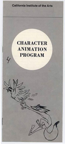
the cover of the Calarts brochure for the animation program; I've been told Disney would routinely send this to anyone asking how to get a job at the studio; I've also been told that the uncredited cover drawing is by Nancy Beiman, one of the earliest students
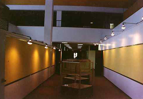
The main hallway of the character animation department, tidied up, cleared out and ready to start the fall semester of 1989
It's fall again; school is back in session. Although I haven't been back for years, lately several events have me thinking about CalArts: the Martha Baxton auction(Martha has been been den mother and stalwart backbone of the character animation program since before my time, when she also did duty in the film school proper); meeting up with some former classmates for a lively lunch; and my friend and colleague Dave Pimentel starting his first foray into teaching(story) there.
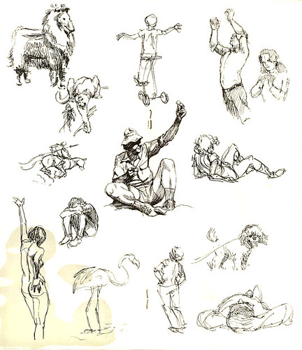
the interior spread of student work from the Calarts 70s-era brochure
At the time I went there, 1987-1990, there was nothing else in the country that offered what CalArts did: a course specifically geared for the art of character, "Disney" animation. Canada had Sheridan, as it still does, NYU had exactly one animation class until John Canemaker began his tenure there...UCLA had a well-known set of classes, even something known as a department, run back then by Dan McLaughlin, I believe. I'd occasionally haunt that area when visiting UCLA's Melnitz theatre for the open screenings of rare films they did and still do. The room held about a dozen animation desks and the usual ephemera of student work(stacks of animation paper, peg hole-puncher, a woody smell of pencil shavings), but its overall atmosphere was more akin to that of Jules Engel's excellent and unique Motion Graphics room at Calarts than it was to the buzzing, coffee-fueled ambiance of the two floors that encompassed the Character Animation department begun by Jack Hannah and Bob McCrea, at Disney's behest, in the mid-1970s. I went on a guided tour of the Calarts campus while in high school, returning afterwards on my own to prowl the rooms without the steely eye of whatever provost gave us a 20 second glimpse of real live animation students at work. This was a time when Hannah, Bill Moore(legendary design teacher of Chouinard), T. Hee and others of the original staff ran the program, and my memory is of gingerly and (I hoped) invisibly walking around the student rooms, accompanied by someone's record player set to 78 rpm, playing a helium-infused rendition of "I Wanna Be Like You" from the "Jungle Book" soundtrack...it was heaven No one took notice of me or busted me(it was a Saturday). I chatted with Bill Berg, who was working on a film about a young kid playing jazz; he was friendly and encouraging when I told him I wanted more than anything to someday get into the school, and be an animator. Bill was obviously older than the mostly 19-23 year olds scattered around the area, and I remember being impressed that someone would commit to CalArts to be an animator after having lived an already full life(he'd talked of his own son, and his music career). Bill went on to Disney's and a long animation career, and I've never heard anyone say a negative thing about the guy, which doesn't surprise me).
Even though no one but Bill ever spoke to me or took any notice, I was ever conscious of trespassing through an inner sanctum I didn't belong to--one that loomed large in my imagination. It wasn't until about 6 years later that I myself got into the department. By then the staff was mostly very young and new, headed by Chouinard graduate and former Imagineering kid Bob Winquist. Bob had retired from running his own design firm, and sort of defaulted into taking over the character Animation department, having subbed for his old friend Bill Moore as design teacher(Bill had been terminally ill). Bob believed in having young, dynamic instructors, and we as a result got Mike Giaimo for character design, Joe Ranft for story, and Chris Buck for animation. They were all old friends who'd gone to CalArts at the same time about 7-8 years earlier, and between the three of them we lucky students had exposure to just about the entire panoply of cartoon design, idea and possibility. Which brings me to a common misconception about my alma mater that persists in some quarters to this day: the idea that there's some sort of "Calarts style", approach or "look". That wasn't the case when I was there, and I seriously doubt it's the case now. While many of the eager young faces in the first-year chairs are (understandably) in love with the legacy of the Disney studio that helped start the place, many, many others love--or prefer--everything from Hanna Barbera to George Pal to Nick Park to Warner Bros' most insane output, to UPA, to the NFB of Canada to...well, you get the drift. There are as many "Calarts styles" as there are people who've gone there--hundreds. It's just a school like any other school; teachers come and go, have a strong influence or not, students listen, absorb or rebel--it's the same everywhere.
Calarts is privileged because of its close proximity to and association with the Los Angeles animation scene, but it's really "special" because of the individuals who learned there, who come from almost every corner of the word, and who bring along all kinds of different ideas and yes, "styles".
I don't believe the character animation program ever stamped out anyone in any kind of mold. That's just my own opinion, but I can easily back it up with the example of many living, breathing animation artists working all over the world today--now joined by the graduates of over a dozen other terrific schools--Gobelins, Sheridan, Ringling, RISD, Art Center, many others--yet still, a school is in the end nothing more a set of rooms to learn in, filled with various people--the true quality of the school is up to them. My school will always have a special place in my heart because of the people I met and learned from while there--as much from my fellow students as from the teachers, which is how Bob wanted it to be, and how it always works out. Far from being in any way elitist, I found Calarts to be a place where we learned to look around, experience more than we might on our own, and pass it on.
ADDENDUM: I couldn't think of a way to work it into this post, but a piece on CalArts wouldn't be complete without a reference somewhere to A 113. So there it is.
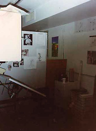
the swanky accommodations of CalArts' animation department, circa Fall of 1989: you got an ex-Filmation animation desk and a chair. The formcore dividers, sheets and other bric-a-brac were up to you. This is my 2nd year space, the back wall of the overlooking mezzanine above the design room. I've got a video printout of Daffy Duck in Bob Clampett's "Book Revue", Ernie Kovacs, a drawing Chris Buck did to help me, and some xeroxes of Colonel Haithi on the back wall there, among other things.
Sep 21, 2006
One moment please
While you were out...
Since the begining of this blog I haven't had a hiatus of this length in Blackwing Diaries--nearly two weeks. Just for the record, I do have new things to post and I hope by the time I do--later today, for a start--someone will still be browsing.
It's been an even crazier time than usual on the work end of things...and animation production is nothing if not crazy as a matter of course. In fact, it's so normal to be constantly breathless and beating deadlines that a moment of calm can feel strangely wrong...it was ever thus, I'd guess, in animation.
Sep 8, 2006
Burny Mattinson podcast
Just a heads up that many of you may already know about:
Clay Kaytis' Animation Podcast has been updated this week with part 2 of Clay's interview with Disney animator, director, story artist and producer Burny Mattinson.
I saw Mr. Mattinson speak once at LACMA, our Los Angeles art museum, at a special screening of "The Great Mouse Detective" in 1986. Vincent Price and I believe Glen Keane and the other directors--Burny, John Musker and Ron Clements--were also there for a panel discussion. There were examples of rough animation drawings by Glen Keane in the lobby, and I vividly recall being stunned at the thought of anyone other than Glen himself cleaning up those lines. They were much rougher than the drawing I posted earlier this week--shocking, emotional, bold shapes.
I remember too how genial and frank Burny was talking about the film...that sort of thing was a rare occasion in those days--a forum like that devoted to a recent animated release. "Basil"(I'll switch to the better, original title-easier to type) itself was a sort of watershed in the art and industry; "Fox and the Hound: had been a soft film, clearly aimed at small children and(with certain big exceptions, such as the oft-mentioned bear fight) unambitious storywise, and it had seemed as if feature animation might wobble along to a marginal existence at best--until "Basil"'s release, that is. While it may look almost quaint with the hindsight of 20 years, at the time it was a blast of cool newness in animation: great entertainment: pacing, performances--in particular Basil and of course, Ratigan, humor...and did I mention the pacing? It was absolutely delightful. I saw it twice, returning to take my usually uninterested brother(a Holmes fan) who thoroughly enjoyed it as did the packed audience at the Fairfax theater(in those days, for you LA history buffs, not yet a triplex).
Of course, Burny Mattinson has had a fantastic animation career(still going) of which "Basil" was but one project, but that title alone is a wonderful achievement. For some thoughts about the rest of his life and work, go check out those Podcasts.
Sep 7, 2006
Merry Xmas from the Disney studio: 1952
click the image to enlarge it
One of the most popular things I've ever posted here was my own 1955 Walt Disney Productions Christmas card, so I knew you would enjoy seeing this example from the studio circa 1952.
It's for sale this week on ebay. Worth clicking on just for the cover illustration, too. I've never yet linked to a current sale of anything, but I feel it's only fair as I "borrowed" the image of the card to share here.
The seller is the well-known local animation dealer Howard Lowery. I used to buy things from Howard when he worked at Collector's Bookshop on Hollywood Blvd. in the 70s, when I'd have to take a bus--didn't drive yet--into Hollywood. The animation material was largely on display in a glass case in the middle of the cavernous room, auctioned off every month. Courvoisier Disney cels from Fantasia or Pinocchio went for whopping sums like $200-400 each.
Howard writes in his description that the interior painting of this card is Mary Blair's. Lovely.
I'm not bidding, by the way, so don't worry about me.
Sep 6, 2006
Barrier's Back (and he's got some choice material)

A dedication from the Boss: courtesy and property of Michael Barrier's collection
I'd guess most visitors to this blog make the same daily stops I do--Cartoon Brew, the Union's "TAG" updates, Animation Podcast, Mark Mayerson, Michael Sporn and Mark Kennedy--among an always increasing roster of great information and never-before-seen graphics.
One in particular that I've been anxiously awaiting an update from is the venerable Michael Barrier's. His is a voice that is as informed as it is opinionated. He's been at the game of animation history and appreciation as long--well, likely longer--than anyone else now writing, including Leonard Maltin and John Canemaker, both heavyweights in the field. You certainly don't have to agree with all his views to appreciate the wealth of information he provides on his website.
The latest, from which the above scan is a sample, is a look at the program to the infamous party where all the hard-working boys and girls of Walt Disney Productions cut loose(I mean really loose)for a bacchanal to celebrate the spectacular success of "Snow White and the Seven Dwarfs". Legend has it that Fred Moore fell backwards out of a second-story window--returning unharmed to the dance floor afterwards. There's also home movie footage I've seen of Art Babbitt playing a "Punk'd" gag on Walt himself, bribing a security guard to tell Walt and his table to keep it down or else. The silent footage with Art narrating shows Walt telling the "officer"(looking much more good-natured than the stories would have it--no doubt he'd had a few like everyone else)"I'll have your badge!"
Michael's posted all of the pages of the program for the day. The cover is especially charming: drawn by Ward Kimball, it shows a golfing Mickey in what Ward contends is the first time the Mouse was drawn with pupils. Check it out, and keep up with Mr. Barrier's news, reviews and history.
He's pondering whether to post some further, rather esoteric(by broad fandom standards)Disney material; I say he should. It's all to the good, especially when, as he mentions, the traditional brick and mortar avenues of research and information seem to be harder to access these days.
michaelbarrier.com
Sep 5, 2006
Monday drawing: a Disney rough from the distant past
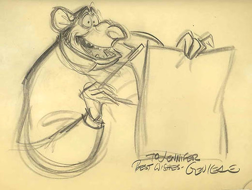
I've gone back and forth over whether to post this, but for a lack of uninscribed items to hand, here it is.
Pretty neat.
I think It deserves to be seen and shared as it's a great drawing from a legendary animator, a key of one of his best-ever performances--the villain Ratigan in "The Great Mouse Detective". The slightly embarrassing part is the inscription--embarrassing, because I didn't then and don't now know Glen Keane personally. This was given to me by an old friend, at that time a newly-minted assistant on "Great Mouse" who offered to acquire this for me and have Glen sign it. Who in their right mind would refuse such an offer? Not me.
This was circa 1985--I was two years away from entering CalArts' character animation program, working in a cinema bookshop, taking the animation union's life drawing night class from Glen Vilppu, putting together a portfolio.
But back to the drawing: it looks better in person--but what a solid, elegant, expressive piece of work it is. Great shapes. I just noticed to my surprise that Ratigan has four fingers on his hands, rather than the usual cartoon three; I suppose Basil, Dawson and the other characters did as well...anyone know? It's marked for an "INHale" from Ratigan at the top, drawn on 12 field paper no doubt with a Blaisdell, lightly creased from rolling at the left side as almost all such roughs are. I've always wanted to see a film where the rough tests are the end-result for the look of the film, where some effort is made to really preserve the immediacy and energy of lines like these. Watching such tests--usually all too short in length on DVD extras--is a visceral pleasure for the eyes.
It's been a nice long weekend. Now we're faced with a short week and two weeks' worth to do in it. It was ever thus!
Sep 3, 2006
Farm Fresh...Cats!
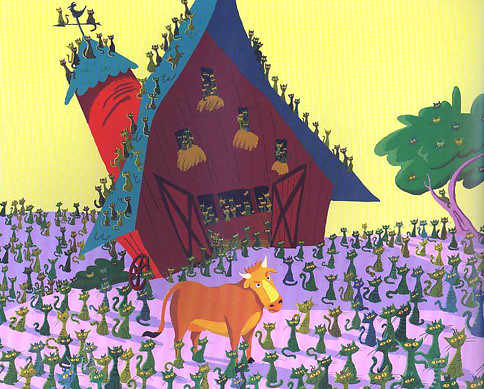
mysterious cats from outer space crop up on Farmer Ray's farm
One of the best raconteurs I know of in animation is Scott Santoro. He makes the dry wit of David Sedaris look like Milton Berle(no offense to Berle fans)...when Scott talks about a grade-school field trip, arriving home with what he thought was a swell gift for his mom, it's an anecdote that produces screaming fits...what he really should have is his own podcast, but what he likes to do best when not storyboarding is writing and illustrating picture books. His latest is Farm-Fresh Cats, just out from HarperCollins children's books.
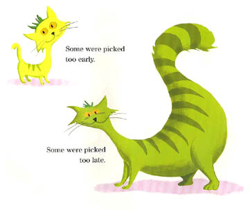
one of my favorite pages
Scott's a veteran of a time when working in the animation business in any capacity was an achievement: the very early 1980s. He started in effects animation, working at Disney on "Something Wicked This Way Comes" and later joined Don Bluth on his initial, best feature, "The Secret Of NIMH". He went back to Disney's for "Lion King" and "Aladdin", and then, after stints at several other studios(including Amblimation, where we met doing story development on an aborted "Cats" adaptation)he settled at Dreamworks, where he moved permanently into story about 3 years ago. His sense of humor always brings the unexpected to the films he works on...he's truly one of a kind.

Scott in earlier days, amassing a killer car collection and entertaining the neighborhood
His books--this is his third title in print in the last several years--are reflections of his own childhood interests and memories. "Farm-Fresh Cats" has been kid-approved by the son of my head of story, who asks to be read from it night after night...anyone with kids who love cats or any animals and have a love of delightful weirdness will enjoy these mysterious kittens. Check it out.
Subscribe to:
Posts (Atom)


